Competitions

I tried working up some ideas for the Antalis Brief (D & AD) but I’m struggling to get a fully formed concept.

“The Challenge Create a physical experience for Conqueror that explores and celebrates the possibilities of paper as a physical, tactile, and creative material for design. Create the unexpected and the imaginative, the inspiring and the innovative – but create it using paper, in a way that brings the medium back to the forefront of creative minds.

It needs to be something that creatives can experience first hand, that inspires them to use paper, whilst challenging their understanding of its possibilities. “

Sketches/ideas

I’ve had a few ideas but nothing I can envision as a fully formed idea. So I moved into a YCN brief, https://www.ycn.org/awards/ycn-student-awards/2017-18-ycn-student-awards/briefs/the-grown-up-chocolate-company, and I’m hoping that might prove more fruitful.

The Grown Up Chocolate Company – YCN Brief

Was thinking along the lines of coming up with a Phrase to represent the new ranges, see quote below, of “dairy free”,”nut free” and “vegan”.

I like the idea of the slogan to represent each and then work on a visual/typography to match that. So far I have two slogans “nut to be”, “no moo for you” and not sure on the third for vegan. Struggling with that a bit, not sure if I can get a workable idea.

“The Creative Challenge

We want you to design a tempting new identity for our new range. Please note, the range is currently in development, so we do not have recipes or variations finalised, but we’re keen to prepare the business for its launch next year.
As well as coming up with a name for the range, we want to see how your new identity will be executed as:

Packaging — create artwork that shows how the new identity will look on our packs (see the Project Pack for cutter guides)

A landing page for the new ‘free from’ range on our online store

Key visuals — these are icons for the range that appear on pack, in print and online. Each emphasises a different message about the product (see Project Pack for current examples). For the ‘free from’ range, we need three key visuals which communicate that the products are ‘dairy free’, ‘nut free’ and ‘vegan’.

As the recipes for these bars have not yet been finalised, we do not expect a fully formed idea, rather an example of how you would incorporate your name and identity for the range onto these different touchpoints. If you’d prefer, feel free to make up bars (EG. Naughty But Nice Nutty Nougat) for this challenge!”

Notes/Sketches

Brand/Brand Competitor Research

I looked at several other brands of vegan/dairy free, luxury/adult brands, etc.

http://www.hollandandbarrett.com/shop/food-drink/snacks/chocolate-cakes-biscuits/chocolate/dairy-free-chocolate/

http://www.hotelchocolat.com/uk/shop/collections/dietary/chocolate-without-dairy/

https://www.plamilfoods.co.uk/chocolate

http://www.nutfreechocolatepeople.com/

Dark Chocolate Salted Caramelised Almonds, , hi-res
Dairy Free
Organic Fairtrade Alternative to Milk Chocolate Hearts
Dairy Free
The All Dark Vegan Chocolate Hamper Collection, , hi-res
Vegan Hamper
Vegan, Nut Free

Superb Salted Caramel Truffles

Chocolate Selection Tray

Chocolate Caramel Pumpkin Preorder

Heavenly Whole Hazelnut Cups

Dribbble Invites

Dribbble is an invitation only website that you can only post your work once you have received an invitation.

“Founded in 2009, Dribbble has grown to become a top global community for designers and creative professionals and an inspiration destination for tens of millions of people. Dribbble is on a mission to build the world’s best platform for designers and creative professionals to gain inspiration, feedback, education, community, and job opportunities.

We are a bootstrapped and profitable company helping the world’s design talent share their creations and get hired. Dribbble has become a go-to resource for discovering and connecting with designers and creative talent around the globe.” – https://dribbble.com/about

You can still join the site without an invite but you can’t post any of your design work. Some designers on there offer invites if you send them your best work, so I have been sending some emails to see if I can get an invite. Will have to see what happens.


UPDATE: 01/01/2018

I received a Dribbble invite today, I need to create a good first “shot” as your first shot gets featured on Debuts page.

Dribbble Invite on 01/01/2018

Siege Magazine – Requesting Submissions

A new magazine is being set up and were asking for submissions. I sent an email and included examples of my work.

I received a confirmation email “Hey Ayshea, Thanks for reaching out and sending us your submission! We’ll get back to you soon with more information about the publication. Don’t forget to spread the word amongst your friends!All the best, SIEGE”

Details about Siege from their Facebook:

“Based in Manchester but representing artists from all over the world; SIEGE is a new, glaringly obvious, platform for emerging artists to showcase their work amongst a plethora of other like minded creatives.

Spanning all creative plains, SIEGE promotes unity. Anyone featured will recommend another artist whom they know. Whether it be as influence or just because they like their work.

The aim is to bring attention to the next generation of artists, designers, illustrators and photographers. To celebrate our numbers rather than deplore them. SIEGEs plan of attack intends on recruiting the masses, slowly linking a web of creatives. Ready to siege the already established, famous, and recognised creatives of today.

First compendium intended for early 2018, we are now taking submissions for fine art, design, textiles, illustration, photography and 3D. Please email any high quality jpegs to [email protected]. With your own details (name, instagram, website etc.) also some information about the work you have sent in. And, most importantly, details of someone you know and recommend to be featured alongside you in the magazine.

S.”

https://www.facebook.com/SIEGEmag/

https://l.facebook.com/l.php?u=https%3A%2F%2Fwww.instagram.com%2Fsiegemag%2F&h=ATMQ8jnOflAqEjcqHLVFpue4H99hh2fbgSw_MiDVADwW9_M__jy2JS49sKvdQ7LYNichCNUXIj-7Xrmq3Ldj97FNibWaHQ4s6yXKUR7bE64TlxhqjpPNJnHe9tLbCUaJXHdj8DPTOBpPHNVhhluZ2tvW_bsqPcd26iHhVVI2SBFxzKSxzyz0WPRiA9nhm8JGebnTgzkfPhvV18LSDLMUZZKulRGtBOaTnu1Dzxu_vM_uKW2pIgAbzCSBE8KiwLIKdWsHI0LZLSb2J7avYRfA7EYUWNBRYe6OdgFKM6GSSryexJrtA-4hEfMe6ezPyTJf9I3j9F4FQbsE3gWbgZnIBPHlRnjwa5FCNRKnT4jqN-cf0rkDJAwy4md0Ug4sks_luELkM8diOPxg0BAs7w9JPmNOLxahSXYBRoWzEPEQv0hz0hykahAe11CI5JRRFBmJJXWS1NAykfX2v_LWY_1inlmJNGTKnVkLl2O9qnymjlfg99_PR6PKalll3DGvUERc9msv6Q

UPDATE: Unfortunately I did not get featured in the magazine, having seen some of their first publication it has a more art slant than design slant. Don’t think my work fits in with what they are looking for.

Morfitt – Freelance Work – Website

After designing a t-shirt and logo the band wanted a website. Another rush job has he had the domain name printed on the t-shirts for an upcoming gig but didn’t have a website (this delayed the printing of the t-shirts and mean’t another amendment to the back of the shirt). For the sake of speed I went through template options with the band’s founder. A few tweaks to the template plus colour changes were made to make sure the theme worked for the band.

He also wanted the website populating with a few posts linking to videos the band had put on Youtube. Links to their Youtube and Facebook profile was added. Unfortunately they were no good quality images of the band – all either low res phone images or stills from Youtube videos. I came up with the idea of adding a halftone effect to hide the poor quality and then converting to duo-tone. The duo-tone added a pop to the images that wasn’t there before. Although in an ideal world good quality images would be used – this is something I have fed back to the band.

Morfitt Website Homepage
Morfitt Blog Post Page

Website: https://morfittmusic.co.uk/

On reflection overall considering the time constraints I believe I did a good job of the site.

Iris Associates & Jaywing

Iris Associates is now part of Jaywing. Jaywing have offices around the world and work with some big brands such as Castrol: https://jaywing.com/work/castrol-the-3-million-mile-story. Jaywing created a storyboard for a 15 minute film for Castrol. Later they designed and built the set too.

Filming – The 15 minute film was set in New York

Jaywing have worked with other big brands such as Doritos, Ann Summers and First Direct amongst others.

https://jaywing.com/work/doritos-for-the-bold
https://jaywing.com/work/first-direct-the-power-of-personal

However, back when they were Iris, they produced a promotional mailer in 2003 – which I have a copy of.  They showcased work for Iceland, University of Nottingham and LearnDirect amongst brands in the promo.

Very interesting contrasting and comparing how design has moved on. However, what I find more interesting is some of this design work was done today, over 10 years later I don’t think it would look out of place. Good design is still good design even after many years, likewise bad design is still bad design years later.

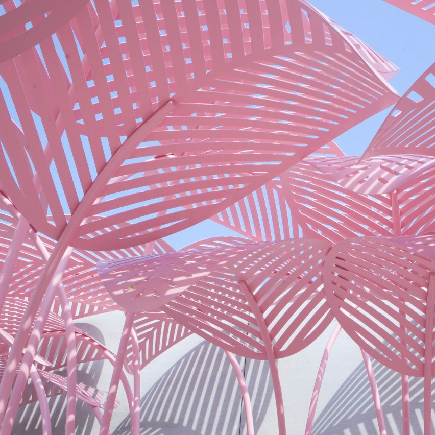
From ‘Millennial Pink’ to Ultra Violet – Colours for 2017/2018

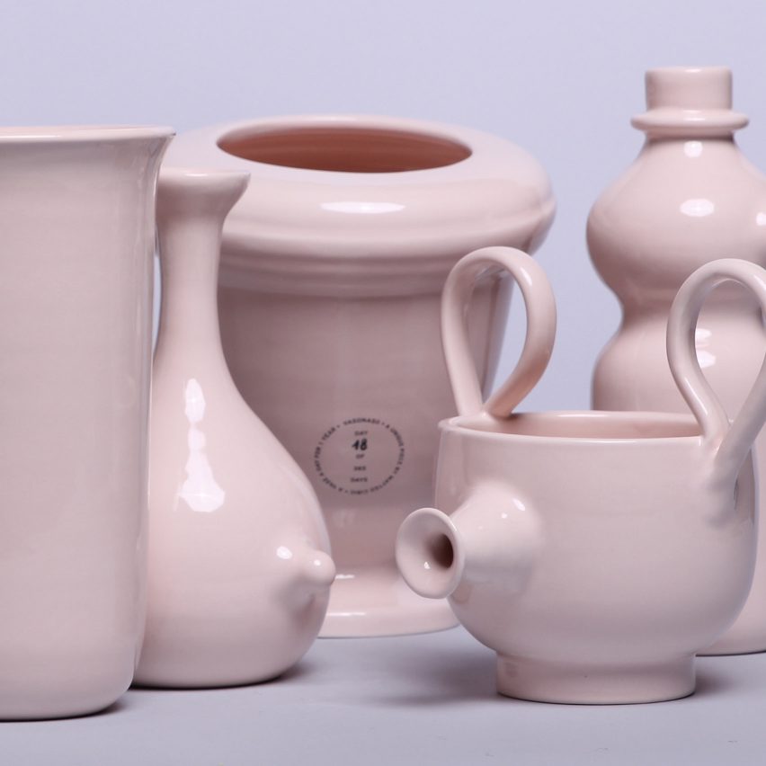
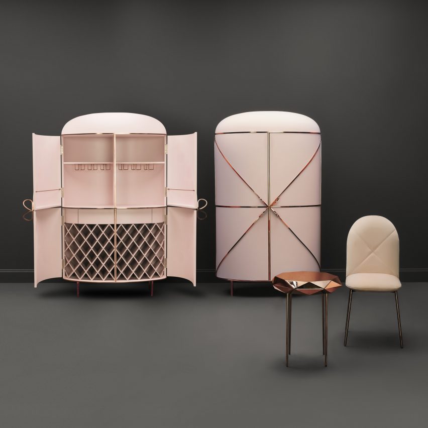
This year saw ‘Millennial Pink’ as the new hot colour.

Marc Ange’s Le Refuge.
Vasonaso by Matteo Cibic
Matteo Cibic
Dezeen Pinterest roundups Pink
Nika Zupanc

https://www.dezeen.com/2017/04/24/millennial-pink-colour-dominates-milan-design-week-2017/

However, as we move into 2018 the colour of next year is set to be Ultra Violet.

https://www.dezeen.com/2017/12/07/ultra-violet-pantone-colour-of-the-year-2018-design-trends/

In 2015 Pantone named a shade of pale pink and pale blue as the colours of 2016.  The Pink is is very reminiscent of the Millennial Pink.

https://www.dezeen.com/2015/12/03/pantone-two-tone-colour-of-the-year-rose-quartz-serenity-pastel-pink-blue/

I have to say I prefer the Pink on the leaf canopy, over the Ultra Violet and the softer pink shown. I normally prefer bright colours over pastels.

Feedback – Creative Practice Outcomes

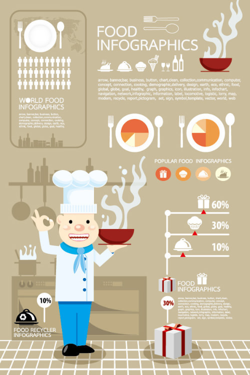
Paul felt my illustration style was fuzzy and not clean like the below:

Image result for vector infographic

Related image

I can understand how professional illustrators, even ones creating a more relaxed style of illustration, would create cleaner lines than the ones I have created. If the Argos advert was a real campaign, then a professional illustrator would be used. However, I do believe my simple relaxed style would still appeal to children.

Morfitt – Freelance Work

My father-in-law plays in a band playing songs from the 60s, 70s, 80s such as Eagles, Beatles and Drifters songs. A logo and artwork was required which he wanted printed on t-shirts for the band. His idea was to have the evolution of man imagery but he wanted one of them to be a police office holding a truncheon whilst scratching his arse.

Image result for EVOLUTION OF MAN

He wanted the band name “Morfitt” to be “in a nice font underneath“. I went one step further and ran with the police theme for the band name. It was a quick turn around job as he wanted it for a gig.

Logo Ideas
Morfitt Logo and Evolution of Man Artwork

I used the Police emblem/badge as to form the O.

Image result for police emblem uk

I originally went with a Serif typeface because I felt it suited their style of music – middle of the road/soft rock/folk rock/pop. However it is hard to align this with the style of artwork he wants which is anti-police/anarchy/punk.

I played around with the typeface to see how it would look with different typefaces.

Logo Work, Different Typefaces

Having getting feedback about the typeface from the client, I worked the 4th logo shown in the image above.

I cleaned up the badge emblem and also the evolution of man artwork.

T-Shirt Mock Up
T-Shirt Mock Up

This is has been a hard brief to work due to the juxtaposition between the imagery wanted and the band’s music style.  I don’t believe it is possible to combine the two without it either looking incoherent or without leaning further to one style than the other. The final logo is probably the nearest I could get without going too far either way but I don’t feel it reflects their music style, however, the client is happy with the design and is going to get the t-shirts printed himself.

The band also had differing views on how the work should look. The singer wanted “one of the men to hold a guitar or there to be a music note on the front to indicate it is a band” as he was worried that the t-shirt did not look like a band t-shirt. The singer also wanted a lot of extra information on the front too – he was persuade by the other band mates to drop both ideas. Also he kept wanting to add extra information to the back which mean’t a delay yet needed the t-shirt quickly. Working with a client where there is more than one person making the decision caused delays and wasn’t easy to do. If I was to do this again I would suggest naming one person as the main decision maker.

Christmas Cards and Web/Social Updates

Updated Behance, Twitter, LinkedIn and Pinterest with my recent Argos adverts for Creative Practice. Also added my Christmas Cards, as shown below to my website.

Reindeer Christmas Card
Snowman Christmas Card
Star Christmas Card
Tree Christmas Card

Bit of illustration practice – hand-drawn illustrations converted to vectors then colourised using Illustrator. This has been good illustration practice for me and will be useful for when I set up my Etsy shop selling illustrated cards.

School’s Reading Volunteer

Sheffield Council advertise for Reading and Talking Volunteers to visit Primary and Secondary schools. This would provide me with experience in a school but at the same time something I can work around having two children/studying. The role requires between 1/2 to 1 hour each week for between 6 to 10 weeks.

https://www.sheffield.gov.uk/home/schools-childcare/reading-volunteers.html

It is also one of the ways recommend by the Get Into Teaching Website to help gain classroom experience:

“To improve your chances of gaining school experience, you could also offer to volunteer at a school. Volunteering in general is a great opportunity to gain experience of working with children. You could also volunteer to work in a youth club or as a Scout or Guide leader – particularly during summer when schools are closed.

Many volunteering opportunities, such as after-school clubs, sports coaching or youth schemes, take place during evenings or at weekends, so you can fit volunteering around your existing commitments.”

UPDATE: I attend a training session on the 26/02/2018 and have contacted the school about arranging a suitable time to start my volunteering.