I have shared the work across social media.

7 Views

183 Views, 32 Likes

Unknown Number of Views

7 Views

1 Re-tweet, 2 Likes, 83 Impressions
I have shared the work across social media.
7 Views
183 Views, 32 Likes
Unknown Number of Views
7 Views
1 Re-tweet, 2 Likes, 83 Impressions
Paul felt my illustration style was fuzzy and not clean like the below:
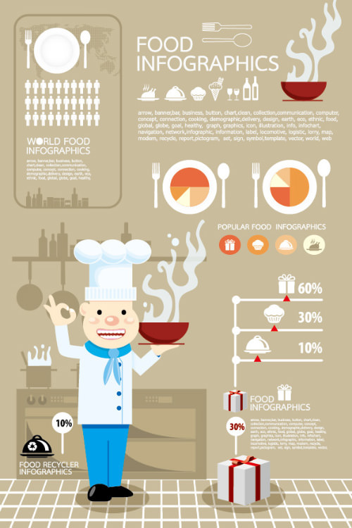

I can understand how professional illustrators, even ones creating a more relaxed style of illustration, would create cleaner lines than the ones I have created. If the Argos advert was a real campaign, then a professional illustrator would be used. However, I do believe my simple relaxed style would still appeal to children.
Hollywood has been challenging some of the gender stereotypes through remakes and promoting strong female leads. For example Ghostbusters (2016).

The recent Star Wars Film, The Last Jedi has a strong female lead in the name of Rey.

There is also the upcoming remake of Ocean’s Eleven with a female cast.
Some people have been unhappy in what they perceive to be casting females just appeal to the left wing, feminists, etc. For example casting a female to play the Doctor in the Doctor Who series (https://www.hollywoodreporter.com/live-feed/doctor-who-steven-moffat-jodie-whittaker-backlash-comic-con-2017-1023733).
Al Murphy created these brilliant illustrations for one of my sons favourite books, Kitchen Disco: http://www.al-murphy.com/


Axel Scheffer has illustrated some of the most popular childrens books.


I wanted my own illustrations to be hand-drawn as I feel the simplistic style of the illustrations would attract children and the bold colours would attract both children and parents.
Nick Sharratt, who has also worked with Julia Donaldson to some very bold and bright illustrations.


Quentin Blake has a very fluid, relaxed illustration style. And has created illustrations for many children’s books such as Charlie and the Chocolate Factory, The BFG, The Twits, and Beatrix Potter’s The Tale of Kitty-in-Boots, amongst others.


Lots of colour throughout Argos adverts.
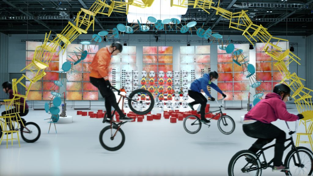


https://www.youtube.com/watch?v=XxbLS91b_Go
Initial sketches/notes/experimental designs and notes for gender reversal/gender neutral advertising.


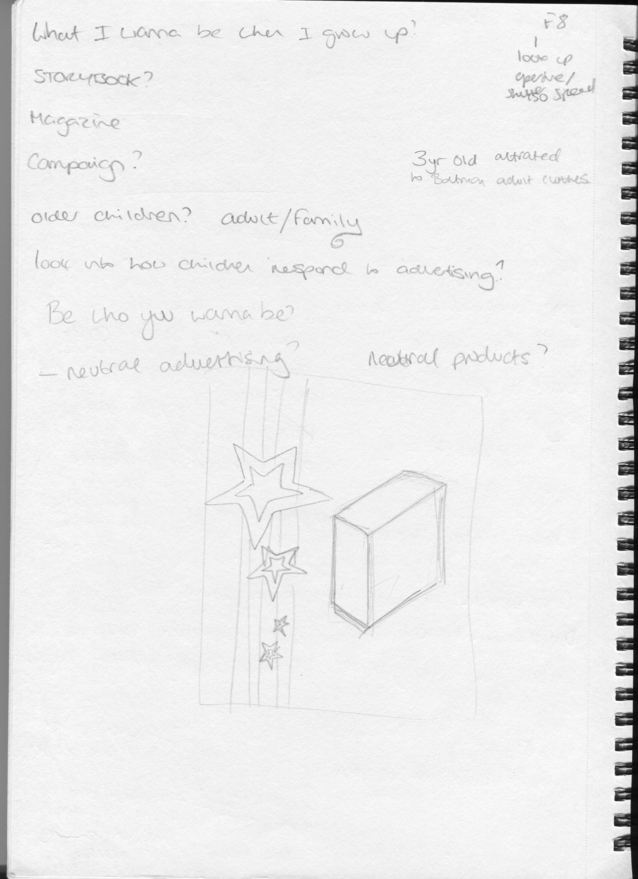


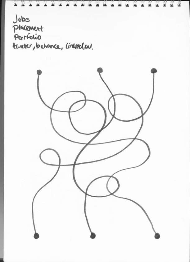


Feedback about the above design that it wasn’t different enough, seen as normal for girls to ride bikes. The slogan needs to be associated more with the opposite gender for it to stand out but the boy/toy washing advert received positive feedback as it challenged gender stereotypes.


I have had to search hard for suitable images. Girls playing with “boys” toys is a lot easier to find than boys playing with “girls” toys. I need to find the right images, images big enough and work with a phrase. Therefore not all ideas have come in to fruition.
One of the images was of a boy looking into a washing machine. It wasn’t working in its current form so I drew a vector washing machine. This added a more fun, child-friendly feel and consistent with the other adverts.
The path puzzles are to be printed in magazines so they are more subtle. 3 toys will be used in the ads – one gender neutral, one non-stereotypical and one stereotypical. No toy is wrong, a boy can play with a boys toy and a girls. No saying one is right or wrong.
This webpage, https://www.fonts.com/content/learning/fyti/situational-typography/typography-for-children, provides useful insight into how young children read words.
What I learned from this page:
Another page with useful information: https://www.uxmatters.com/mt/archives/2011/06/effective-use-of-typography-in-applications-for-children-3.php
“..it is advisable to stay away from distorted, decorative, or cursive letterforms. Some fonts that offer optimized legibility, because they were designed specifically for kids, include the Sasoon
font family and Gill Sans Schoolbook.
Also: http://www.creativebloq.com/inspiration/these-10-fonts-for-kids-will-keep-you-young-at-heart
While all ages recognised adverts on TV as adverts, only the older children recognised display advertising as such. The defining characteristic as to whether adverts were considered as such is how much they interrupt the other things that they are doing – TV adverts interrupt the show they are watching, pop-ups do the same; banner ads don’t interrupt and can be passively ignored.
And in all cases the children had developed their own patterns for skipping this advertising as soon as possible – ignoring it, looking over it. When confronted with in-game advertising, for example, the children would leave their phone and mute and go and do something else while the adverts played out. They knew they were coming and had strategies to avoid them.
Interesting how younger children don’t recognise display advertising as advertising. And once children do recognise advertising they learn how to skip it – the advertising needs to engage children so that don’t skip past it.
I want to engage children and I thought about basing an advert on path puzzles as pictured here:

These adverts could feature inside Children’s magazines but also magazines/papers that parents read.
Other Research:
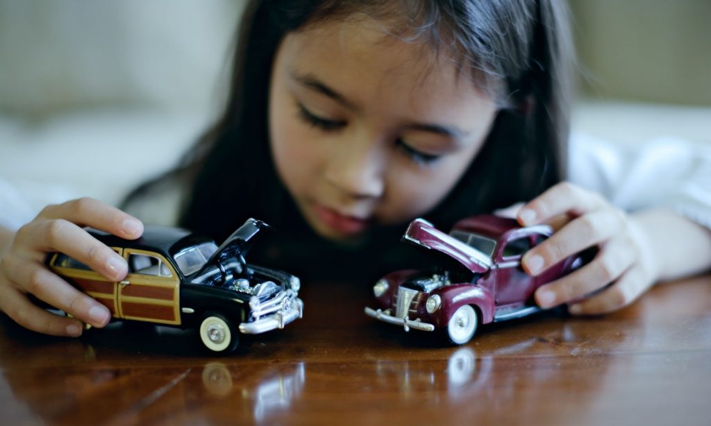
Few shots I took on the theme of switching stereotypes.


Lost the focus on the Pony one but it was low light so a bit trickier. Don’t think I have the technical skills currently for low light/night photography – need to more practice.


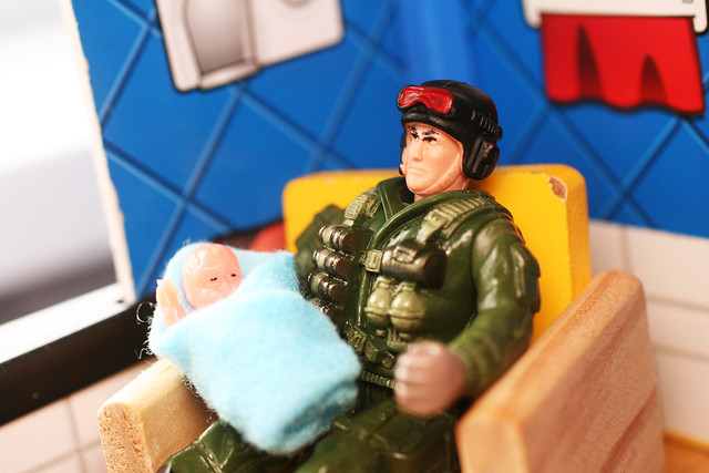
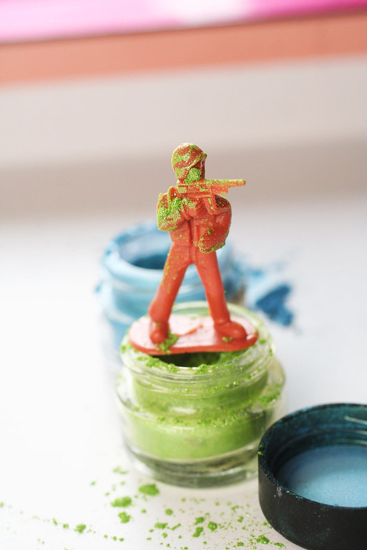

Research toy photography: